
October 3, 2025

Imagine being fresh out of bootcamp and joining your first job. Exciting! You enter a company on the verge of a major rebrand: name, colors, mission — everything. A little daunting, sure. And the cherry on top? Your team is building a design system to complement the rebrand. That’s where things get a little more unsteady. I’d learned about design systems in bootcamp, but building one was another matter. With the rebrand breathing down our necks and our product ecosystem looking like it belonged to four different companies, this was a necessary project. Unfortunately, through a combination of trial-and-error, research, and a healthy dose of pragmatism, it was also a project that would take three years to complete.

Building a design system is a bit like Goldilocks determining what she liked in the bears’ home: some options are too hard, some are too soft, and one is just right. When it came to building EverDriven’s design system, the different iterations followed a similar pattern: the first iteration was too complex, too high-touch for engineers. The second? Pure MUI, so it was simpler for engineers, but aesthetically and practically wrong. The third iteration brought a realization: our “just right” design system needed to leverage MUI’s framework for implementation, but needed more attention to detail than MUI — or even our own brand guidelines — could accomplish.
With no idea how to begin, we started by creating a vision statement for the system, a guiding principle we could refer back to as we developed. What started as a Miro board to create a value proposition became organized, with several visions to choose from. Now, the system had tenets to adhere to:
And goals:
When it came to documentation, the vision and tenets were front and center, so anyone using the design system understood the mission.
While this helped clarify things, we still felt shackled by the color scheme for the brand. Short of telling marketing to go back to the drawing board, we started adjusting the existing colors to suit better a digital environment: fewer tones, more vibrant hues. Strict adherence to WCAG contrast rules. Specific use cases for each color. All within MUI’s color framework (with a few additions). Having brighter colors also allowed us to develop a better dark mode proof-of-concept, which only cemented our decision.
Typography came from the original design system work, with minor adjustments for kerning. It’s probably the only thing that came from the first iteration of the system.

When it came to components, we decided to keep between 70% and 80% of MUI’s existing ecosystem, including buttons, input fields, and tables. The nuance came with curating the rest of the library. Some components we didn’t like aesthetically, like MUI’s switches (which we swapped for Material Design 3’s component). Others didn’t suit our needs fully, like the date picker. The rest of the MUI components we eliminated, either because we didn’t need them from a usage standpoint, or because having instance and paper components wasn’t practical from a design standpoint. The remaining components were custom, high-touch components of our products that had to be custom-built to suit the needs of the business and user.
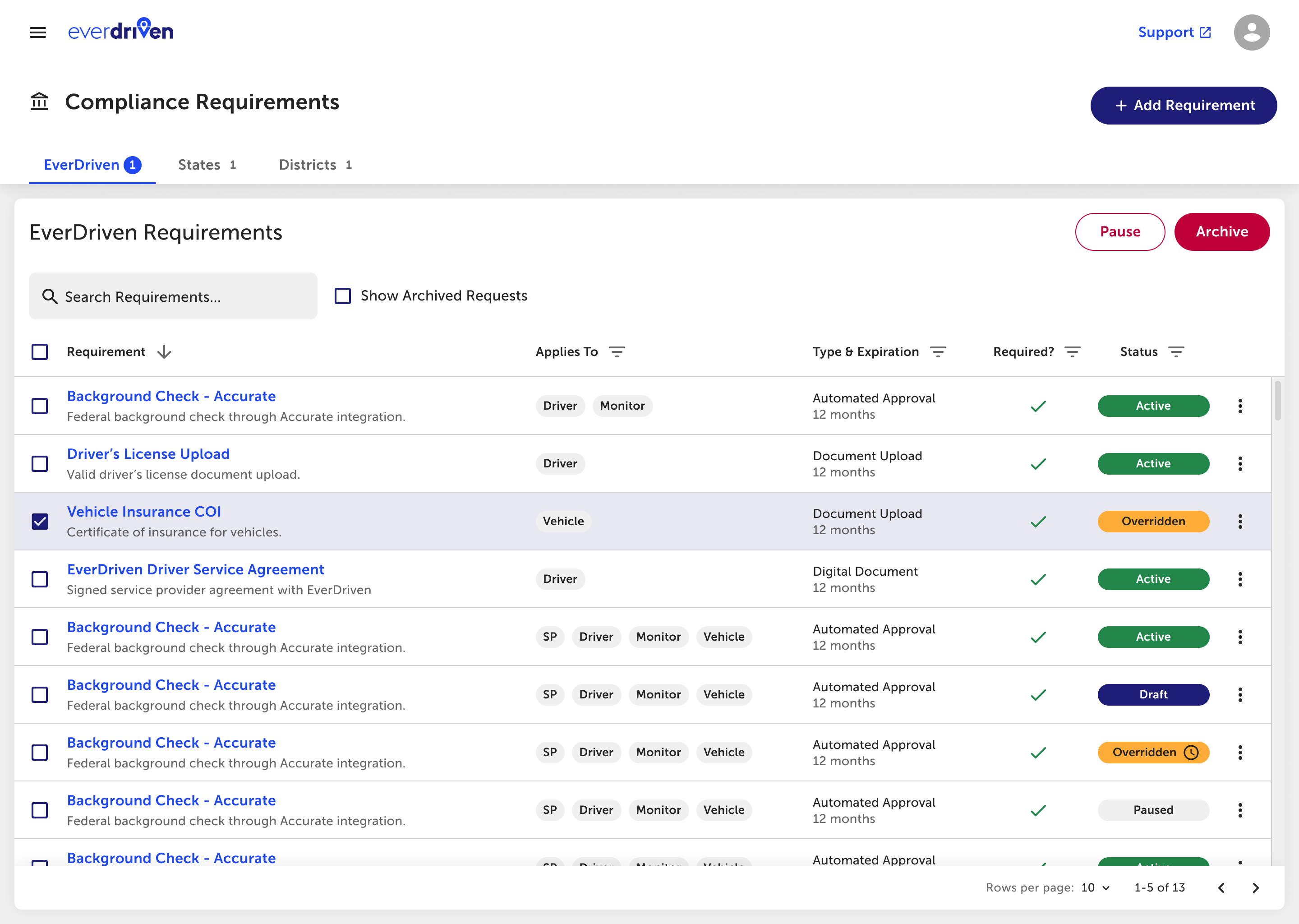
Doing this on the fly, with no prior design system experience, I learned how to do things (and not to do them) through trial and error. We’d never reached the documentation portion of the system before — at least, not on this scale. So while MUI’s Figma framework helped us create most of our components with ease, documentation was a bear. I quickly learned that perfect is the enemy of the good while writing, because there was so much to write that I wanted to re-edit (AI was helpful here!). Communicating to engineers had to be more than pointing them at a Figma file, because the systems were *just* similar enough that they weren’t recognizing the differences when building the frontend.
The result? The EverDriven Design System has reduced frontend development by 66%, and the time it takes for designers to produce a V1 mockup has gone from 5 days to 2. It’s still evolving and will likely always have a small state of flux, but it’s more solid than anything that came before. And it taught me an important lesson: just because you’re not an expert, doesn’t mean you can’t do your homework and give it a shot. You only grow when you do things. And while this wasn’t an area of my skillset I had envisioned growing, it’s taught me some valuable lessons: sometimes being pragmatic gets you further ahead than reinventing the wheel.
